While completing our research for our most recent EdTech Playbook installment, we took a virtual tour of district websites around the country. What we found was a glimmer of hope and ten districts that clearly understand the value of user experience.
A quick note: Some of the subjects below are small, while others boast enrollment numbers in the high five-figures. Some are located in wealthy pockets of their respective states, while others are right in the thick of urban poverty. The one thing these districts (and their leaders) have in common is that they chose to prioritize their web presence.
1) Alpine School District, Utah
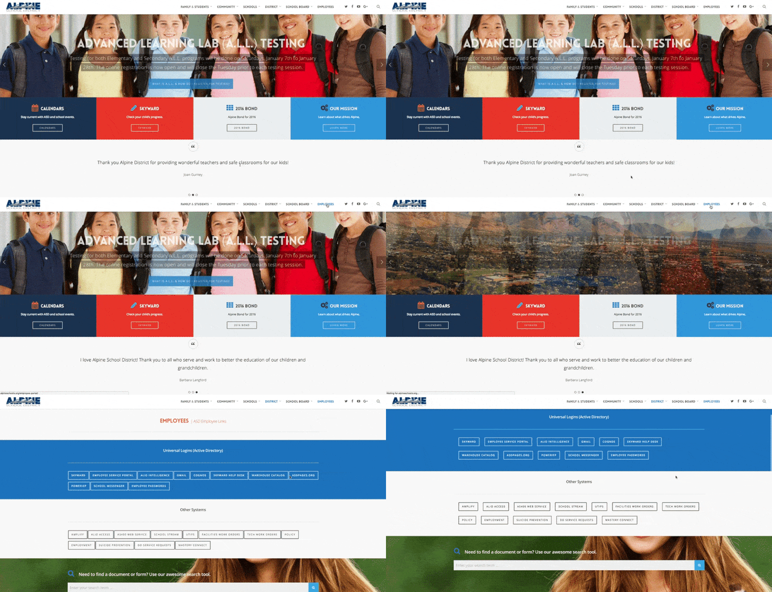
There's a lot to like about Alpine's website, from the simple, clean menu, to the above-the-fold call-to-action items for popular destinations. Drill down into any of the persona-based links and you'll find some nifty curation (see the example for staff login portals above) and an easy-to-find search area. One of the best parts of this site is the rotating testimonials. In the age of school choice, district communication leaders need to be become marketers, and Alpine's website does a great job of making the district feel welcoming.
2) Arrowhead Union High School District, Wisconsin
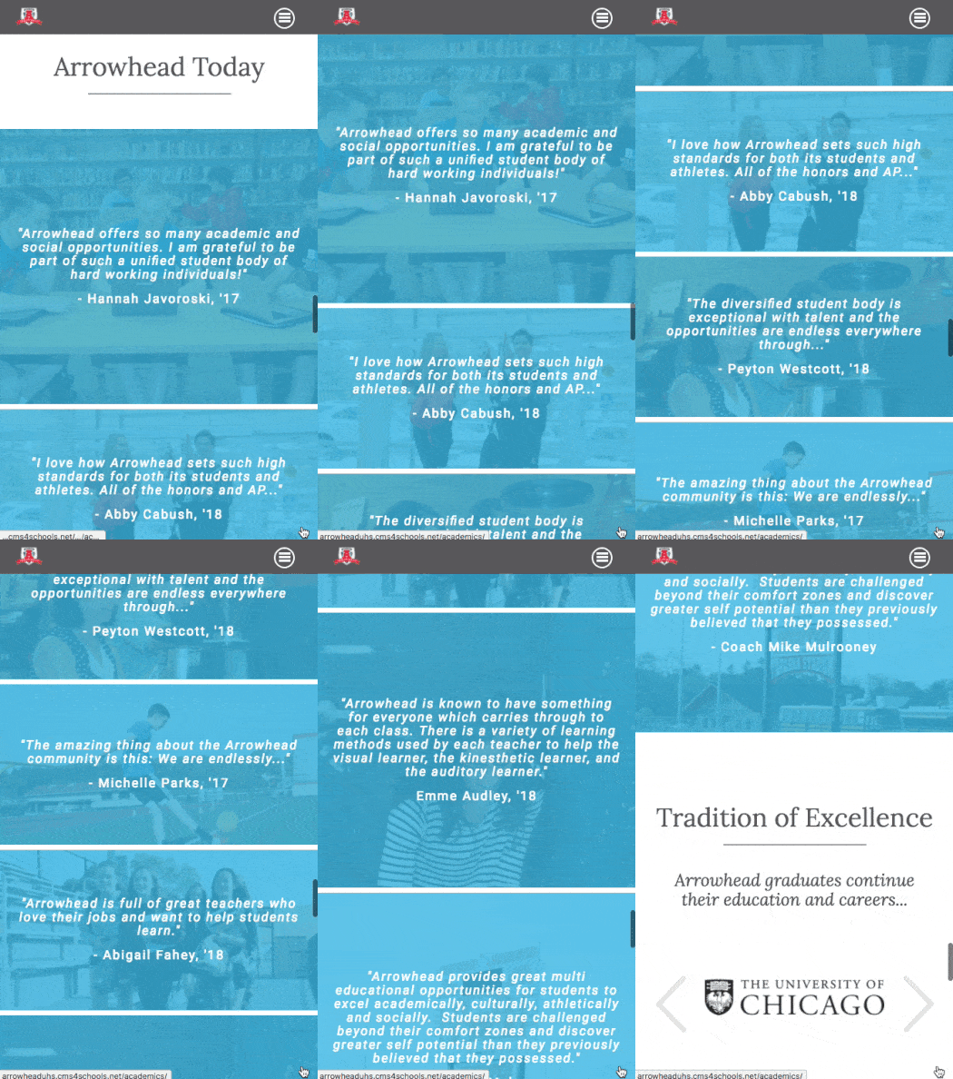
Speaking of testimonials, take a look at the above section from Arrowhead Union HSD's mobile site. This website's responsive design, beautiful cover image, and well-organized menu structure is just the beginning. The homepage features several varied and fun uses for icons, including a slider of college logos displaying frequent destinations of Arrowhead grads, interactive statistics, and quick links at the top of the menu. The district's LaunchPad Portals for parents, students, and staff offer easy access to resources with no scrolling necessary.
3) Community Consolidated School District 59, Illinois
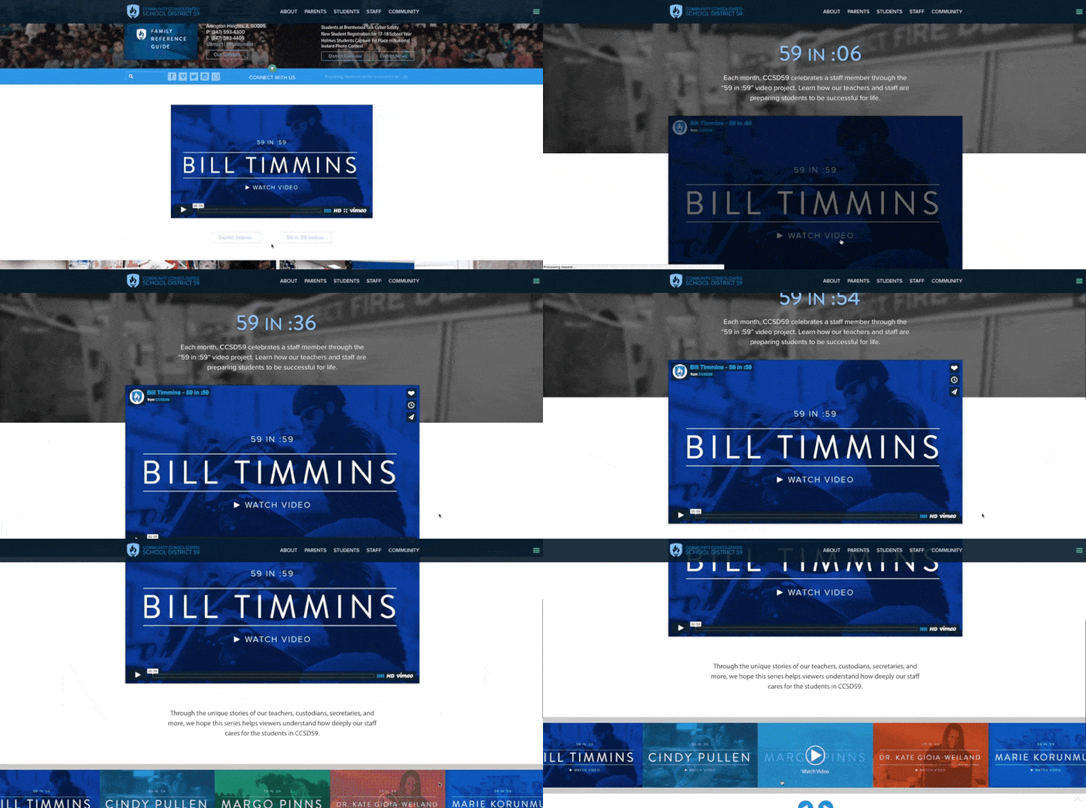
CCSD59 may very well have the best digital media team in the country. The district makes this list not only because of their strong website design, but because of the beauty and value of their visual content. Their cinema-quality video has made its mark on the national stage already (if you haven't seen the Future Ready video yet, check it out here). The natural integration of photography, video, and interactive design elements throughout the website make for a thoroughly enjoyable experience—but that's just the beginning. CCSD59 has committed to making their community a better place, and showcase that commitment to equity front and center on the site.
4) Derby Public Schools, Kansas
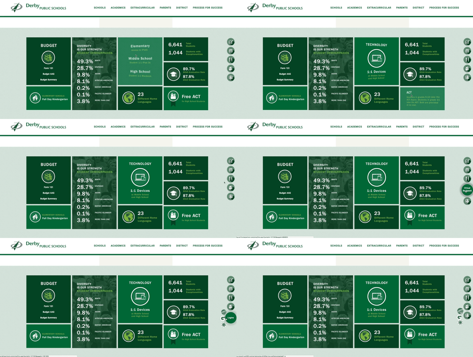
Derby Public Schools stood out as one of the few districts to include a direct acknowledgement of the "Future Families" audience segment. While other districts provide a basic "About Us" page, Derby's simple act of personalizing the experience makes a difference in how it's perceived. The quick links stuck to the right side of the screen are a unique element that allows this district to save space in its menu while providing one-click access to key destinations.
5) Garland Independent School District, Texas
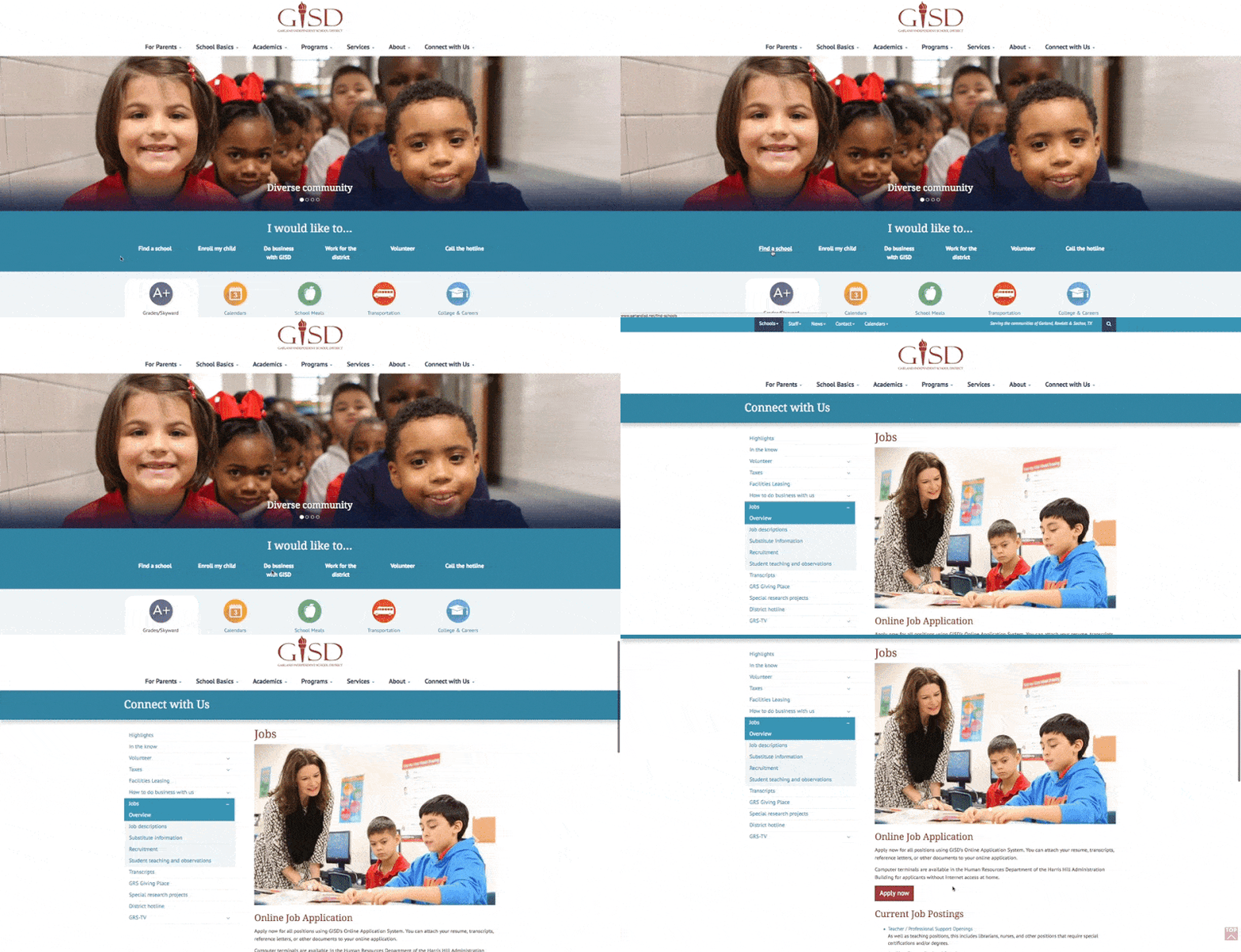
We have previously featured Garland ISD's outstanding work in the realm of parent engagement, and their website is a testament to the commitment they've made in that area. In fact, the very first link a visitor sees in the district's menu is titled "For Parents." You can tell a lot about an organization's priorities by looking at their home page. Accessibility and transparency are a priority, as evidenced by the quick links and translation services.
6) Lehigh Career and Technical Institute, Pennsylvania
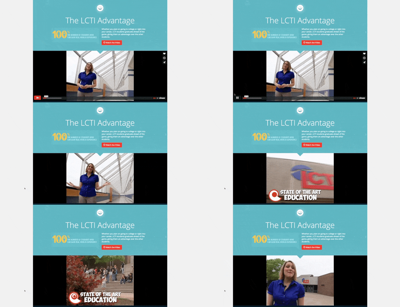
For a non-traditional school system, messaging and awareness are even more important than they are for a typical public school district. LCTI blends some strong navigational elements for its community with a multimedia promotional section for those doing their research before enrollment. This website clearly demonstrates the benefits of CTE while incorporating LCTI's culture and personality in a branding effort that works. Crisis communication is handled clearly and carefully on the home page, cutting through the fog of uncertainty.
7) Little Falls Community Schools, Minnesota
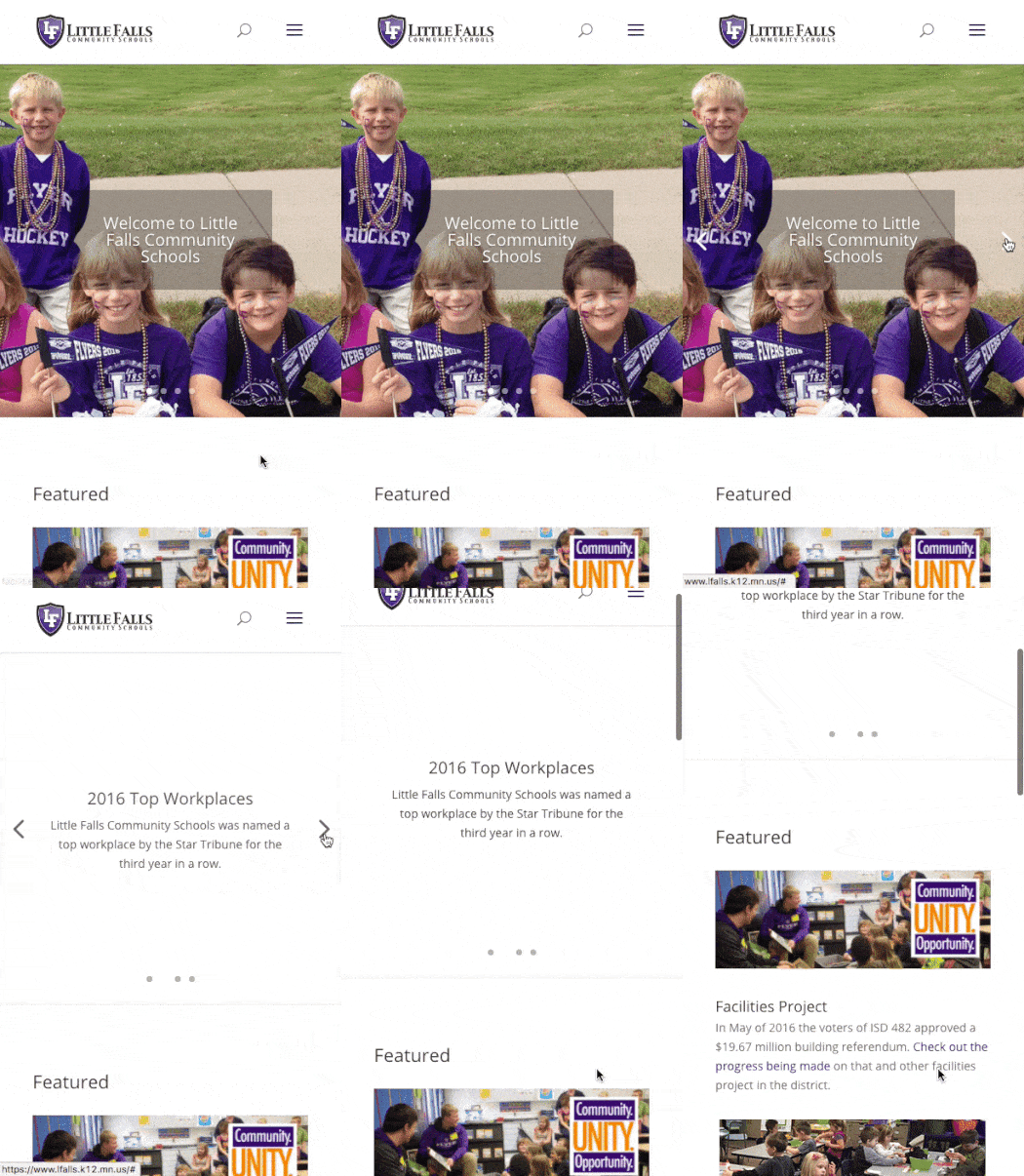
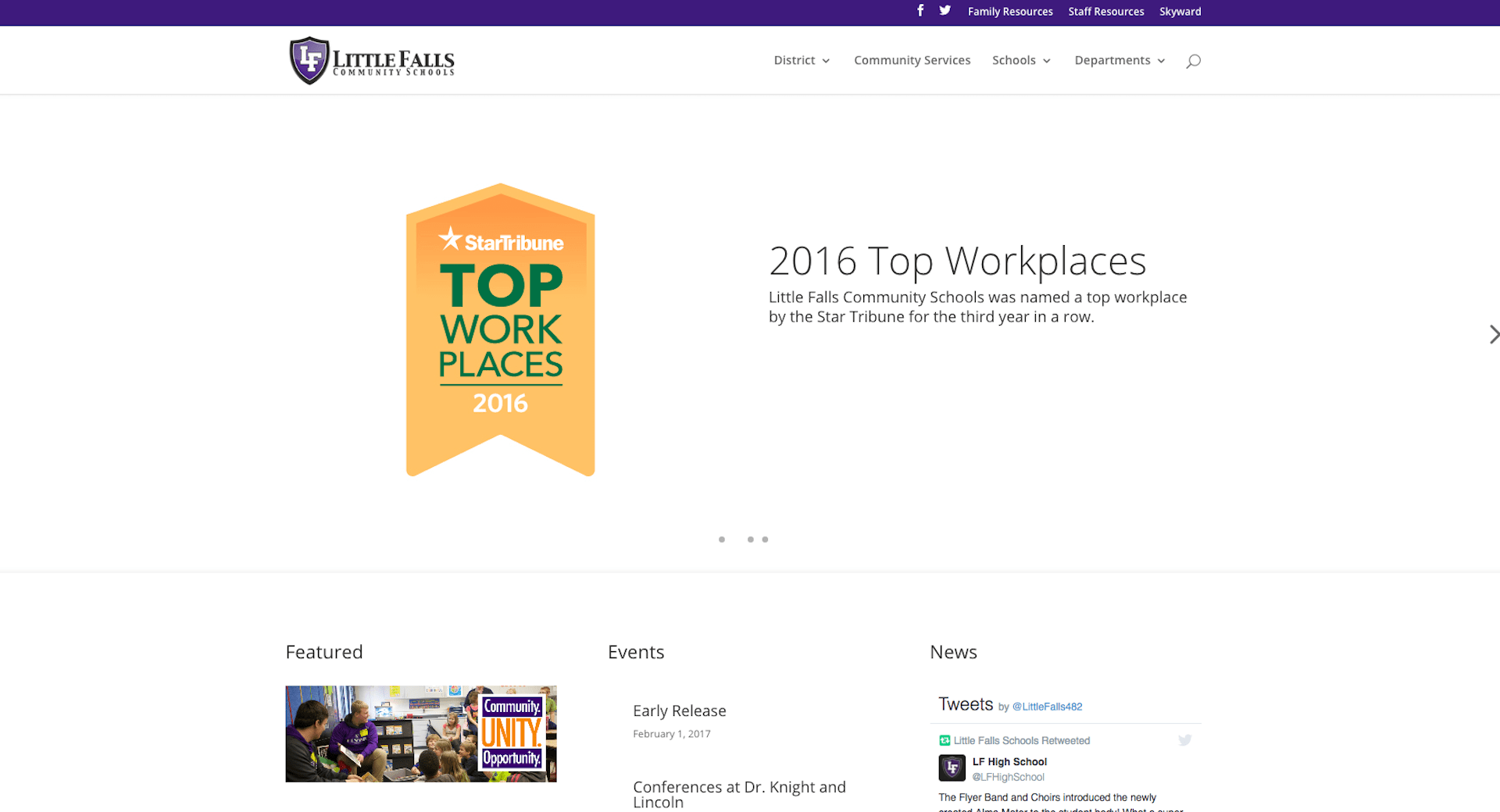
Little Falls' elegant website is free of the clutter most districts get when trying to present too much information. Little Falls makes it easy to focus on their priorities. This is yet another example of how your organization's culture should be reflected on your home page. Little Falls already looks like a fun place to work, and they make it easy to find a career.
8) Oak Ridge Schools, Tennessee
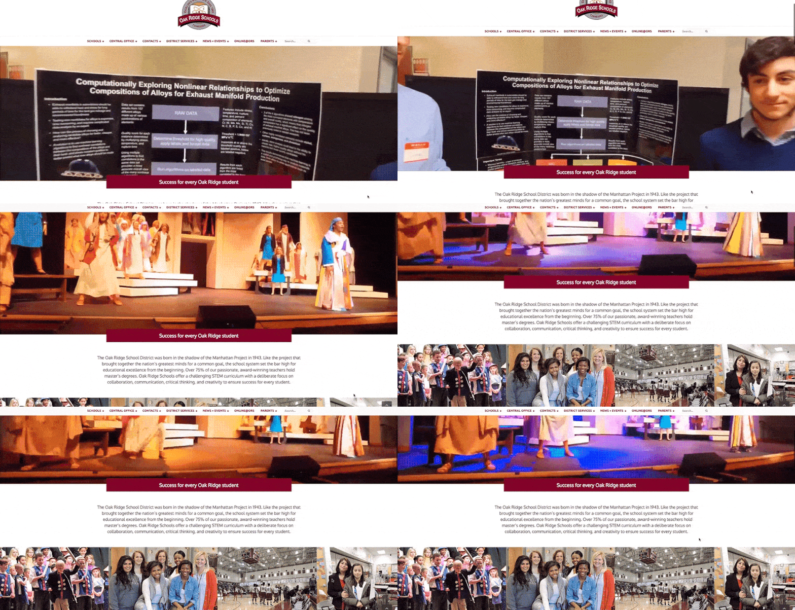
Oak Ridge starts with a compelling narrative of their district story. After we've had a chance to take in the moving combination of arts and science at the very top, we scroll down to find a short text paragraph that supplements what we've just seen with a clear, concise, and unique picture of the district's mission. It's a classic elevator pitch with a healthy dose of culture, and it sets the tone for the branding that follows.
9) Seminole County Public Schools, Florida
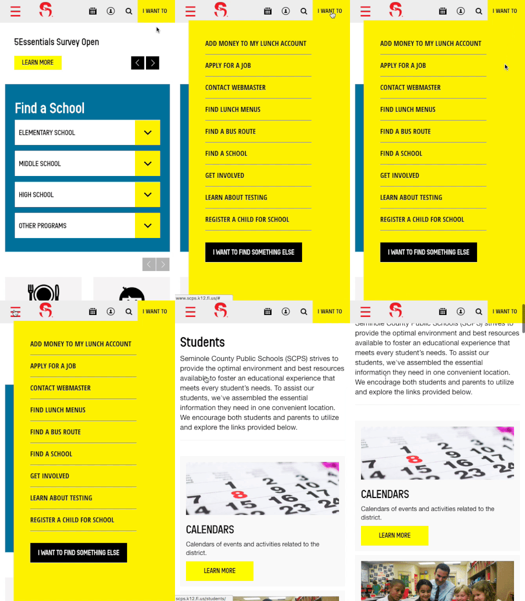
The SCPS website is a marvel on any device, but its intuitive design makes for an especially pleasant experience at the mobile level. The "I Want To" menu option is an indicator that the webmaster understands the district's audience and has done the research to identify the most popular destinations.
Instead of the traditional drop-down menus for granular links, SCPS offers landing pages by persona, then presents relevant content in an engaging and orderly fashion. In terms of pure navigation experience, Seminole County Public Schools is the gold standard.
10) Vancouver Public Schools, Washington
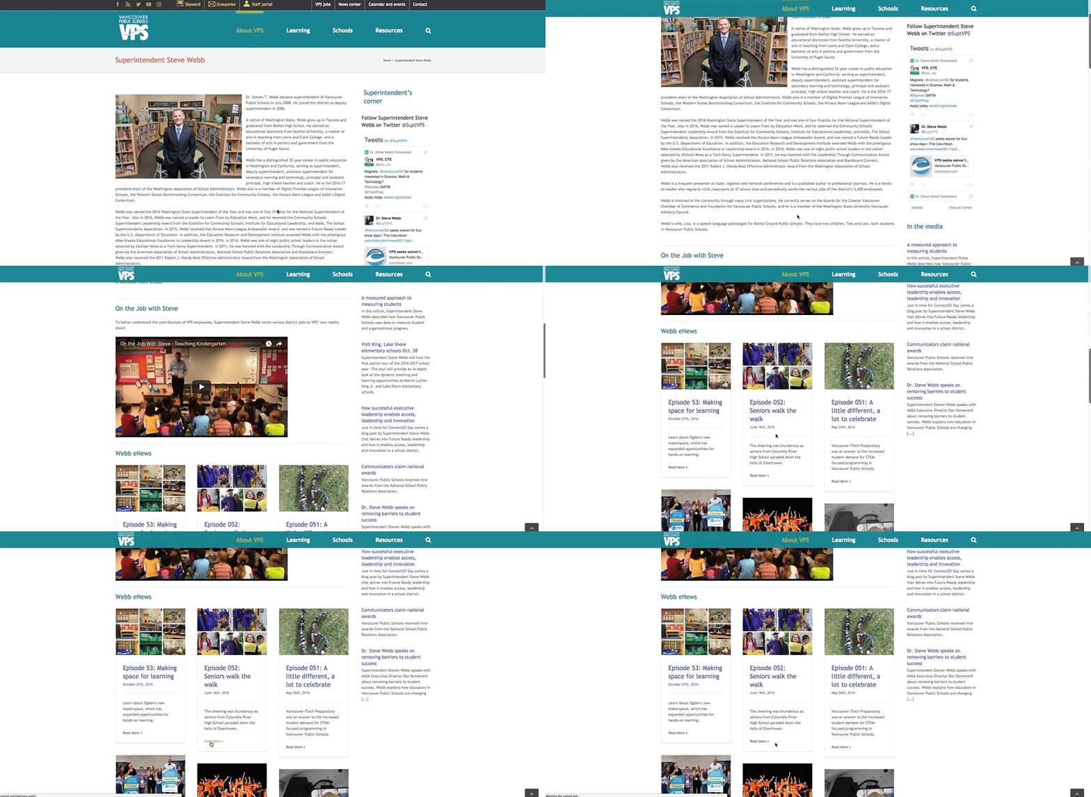
Vancouver Public Schools makes connecting with their community a priority. The home page offers a colorful array of calls to action to get all sorts of community members involved, including links to volunteer opportunities, new students, arts, athletics, even a rundown on how construction projects are changing the face of school buildings.
A nice feature is dedicated to the superintendent's biography. Your superintendent is the face of your district—if transparency and communication are a priority, carve out a prominent corner of your website and keep it updated with new content on a regular basis.
The benefits of a website redesign are many, the risks small. No matter what your site looks like now, all it takes is a little commitment to transform your web presence from one that turns people away to one that offers a more accurate reflection of what your district really stands for. Build your brand and show your community that you're committed to delivering a better experience.
WHAT'S NEXT FOR YOUR EDTECH? The right combo of tools & support retains staff and serves students better. We'd love to help. Visit skyward.com/get-started to learn more.
|
Advancing K12 Staff Edtech Thought Leaders |


